External wall colors can vitalize the
building itself, make the building serene, elegant or flowing, and create a
sense of beauty. The buildings’ external wall colors become richer as our world
is developing and people’s aesthetic appreciation is increasingly improved.
When designing terracotta external walls, the architectural designers take full
consideration of the rules for using colors so that the buildings will have
unique external wall colors. The most frequently used method to design and
apply colors is to collocate terracotta panels of the same color category.
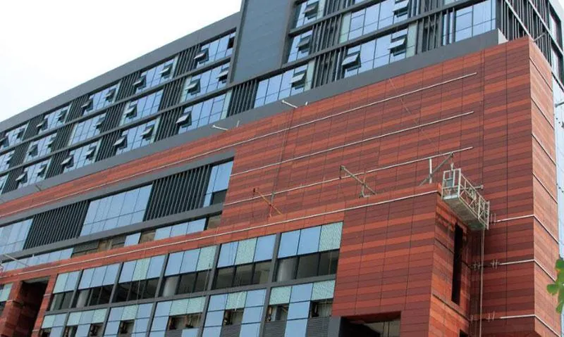
Shangfenggang Times Plaza, Chengdu City,
China
It is a large leisure and shopping center.
The architectural designers select
terracotta panels of three colors (coral
red, dark red, brownish red) that belong to the same category, and randomly
collocate and apply those panels to the lower facades of the buildings. Red
colors create warm and pleasant atmosphere for the plaza, meeting the color
preference of the people in Sichuan Province. Red colors of three different
intensities vitalize the building facades, and go well along with the gray
color of the building’s higher external walls and glass.

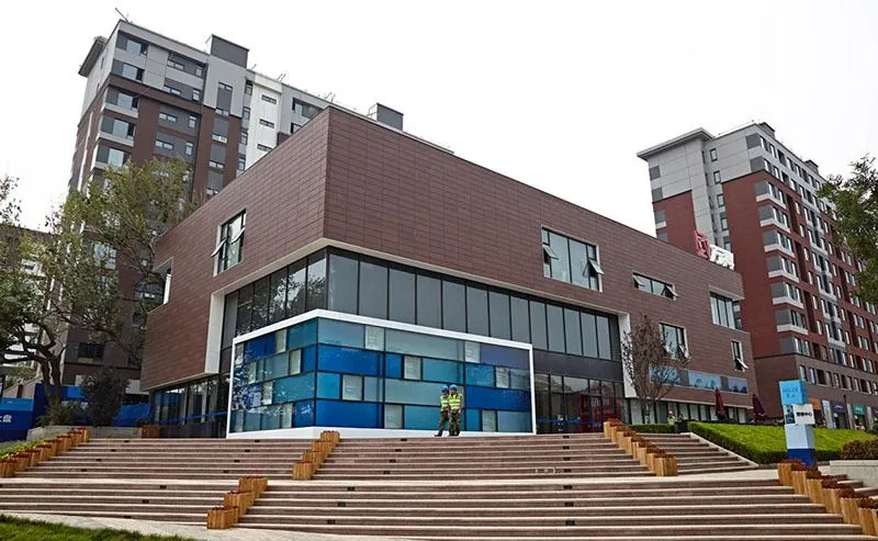
Sales Center for Vanke Lanshan Residential
Buildings, Dalian City, China
The architectural designers select LOPO’s
wet-cladding terracotta panels (light
terracotta panels) as the external wall
material for the sales center. The designers select terracotta panels of three
colors (brown, light brownish gray, dark brownish gray) that belong to the same
category, and randomly collocate those panels to highlight the high-end image
of the commercial buildings. To balance the relatively dark colors of this
small building, the designers select small-sized terracotta panels (192mm wide × 600mm
long) instead of conventional-sized panels to make the entire building become
exquisite.

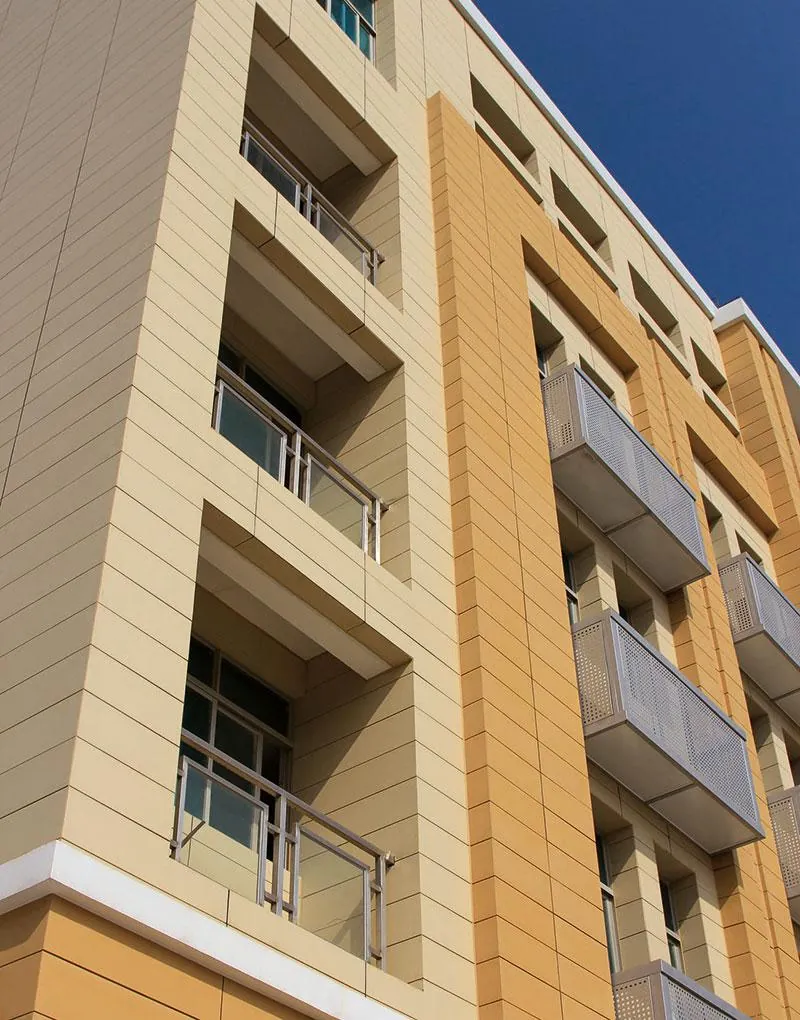
City Hall Renovation Project, Pingtan City,
China
The project is the renovation of an office
building for Civil Engineering Bureau of Pingtan City, China. The designers
select terracotta panels of two colors (Champagne-yellow, beige) that belong to
the same category. Beige color is used as the basic tune in the most areas of
the building’s facades, while champagne-yellow color is independently used on
the pole and frame portion of the building’s facades to outline this building.
Such two colors go well along with each other, meeting the solemn and steadfast
temperament of a government building.

All rights reserved. No part of this
article may be reproduced or retransmitted in any form without prior permission
of www.lopochina.com
